How to Make a Pivot Table Chart in Excel
This article will demonstrate how to make a Pivot Table Chart in Excel.
Creating a Pivot Chart
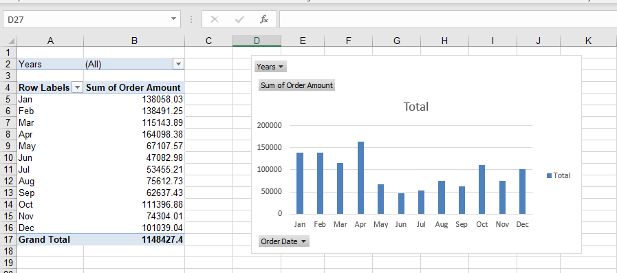
A Pivot chart is similar to a chart created from a table of data, except that it is based on a Pivot Table.
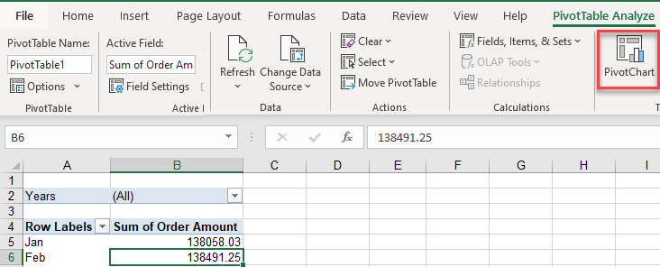
1. Click in your Pivot table, and then, in the Ribbon, select PivotTable Analyze > Pivot Chart.
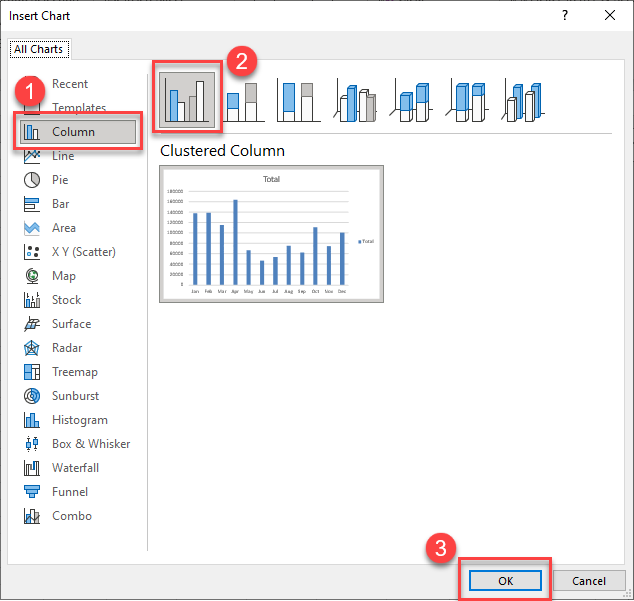
2. First (1) Select the type of chart you wish to create (column, line, bar, etc.), and then (2) select the style of chart (eg Clustered Column). To insert the chart into your worksheet (3) click OK.
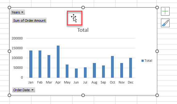
3. Your chart will be placed into your sheet. If you wish to move the chart, click in the middle of the chart – your mouse should then have a small black cross attached to it – drag your chart to your desired location on your sheet.
Drill Down in a Pivot Chart
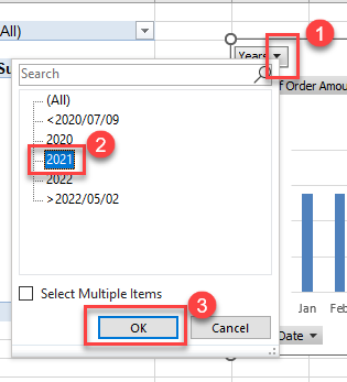
The chart will display all the information that is shown in the Pivot table. You can either filter (drill down) in the Pivot table or in the Pivot Chart. In our example, we can click on the drop down arrow to the right of the Filter field (Years), to drill down to a specific year.
- Click on the Drop down arrow to the right of the Filter field.
- Select the value required (2021).
- Click OK.
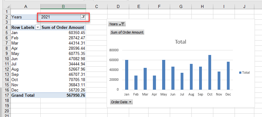
The data in both the Pivot Chart and the Pivot table will be filtered.
Changing the Chart Type
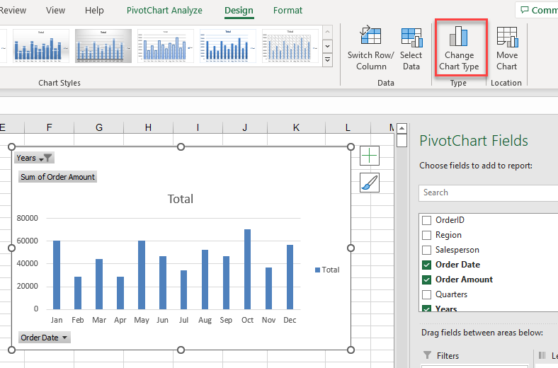
1. Click in your chart, and then, in the Ribbon, select Design > Change Chart Type.
2. Select the type of chart you require, and then click OK.
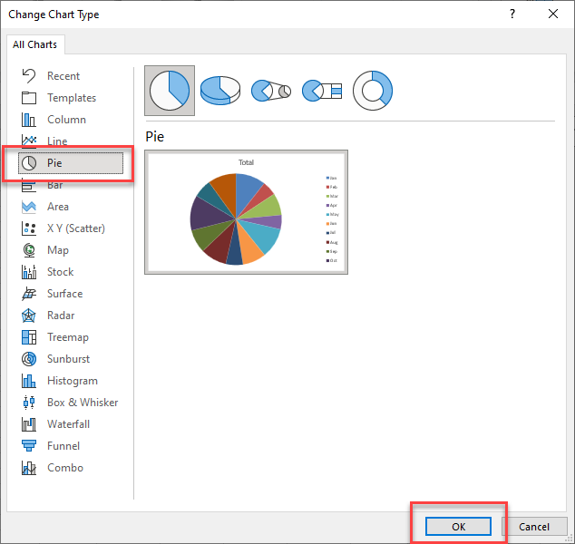
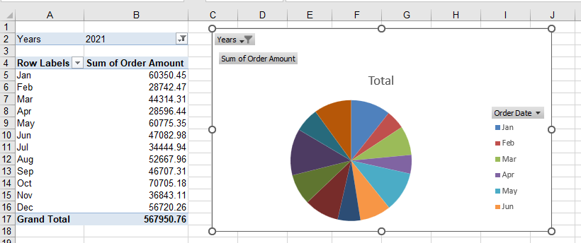
3. Your chart will be updated.
Printing the Pivot Chart
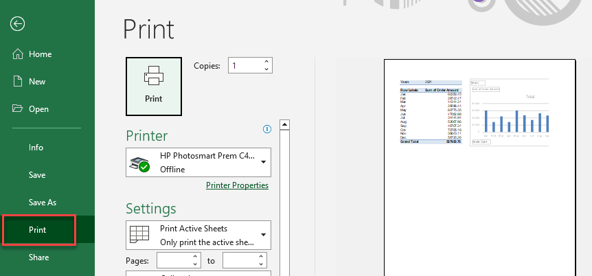
To print just the Pivot Chart, excluding the Pivot table, you can click just on the chart and then, in the Ribbon, select File > Print.
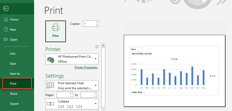
To print the sheet so that both the Pivot table (and/or other content) and the chart are shown, click OFF the chart so that your mouse pointer is clicked on a cell in the worksheet. Then in the Ribbon, go to File > Print.
